
Overview
morphos/react-schema-editor is a lightweight, customizable React JSON Schema editor for applications where users
need to create or maintain schemas visually.
The editor manages JSON Schema state and editing behavior without imposing a page layout or component library. Its
default UI is plain HTML, every structural part can be replaced through the components prop, and optional Bootstrap
3.4 and 5.3 component sets are available when those styles already fit your application.
Use it to:
- build source and destination schemas for data mapping, imports, exports, and API payloads;
- embed schema editing in an existing form, settings page, drawer, or modal workflow;
- keep the schema controlled in React and receive the complete JSON Schema after each change;
- replace individual controls or the complete nested-property layout with application-owned components.
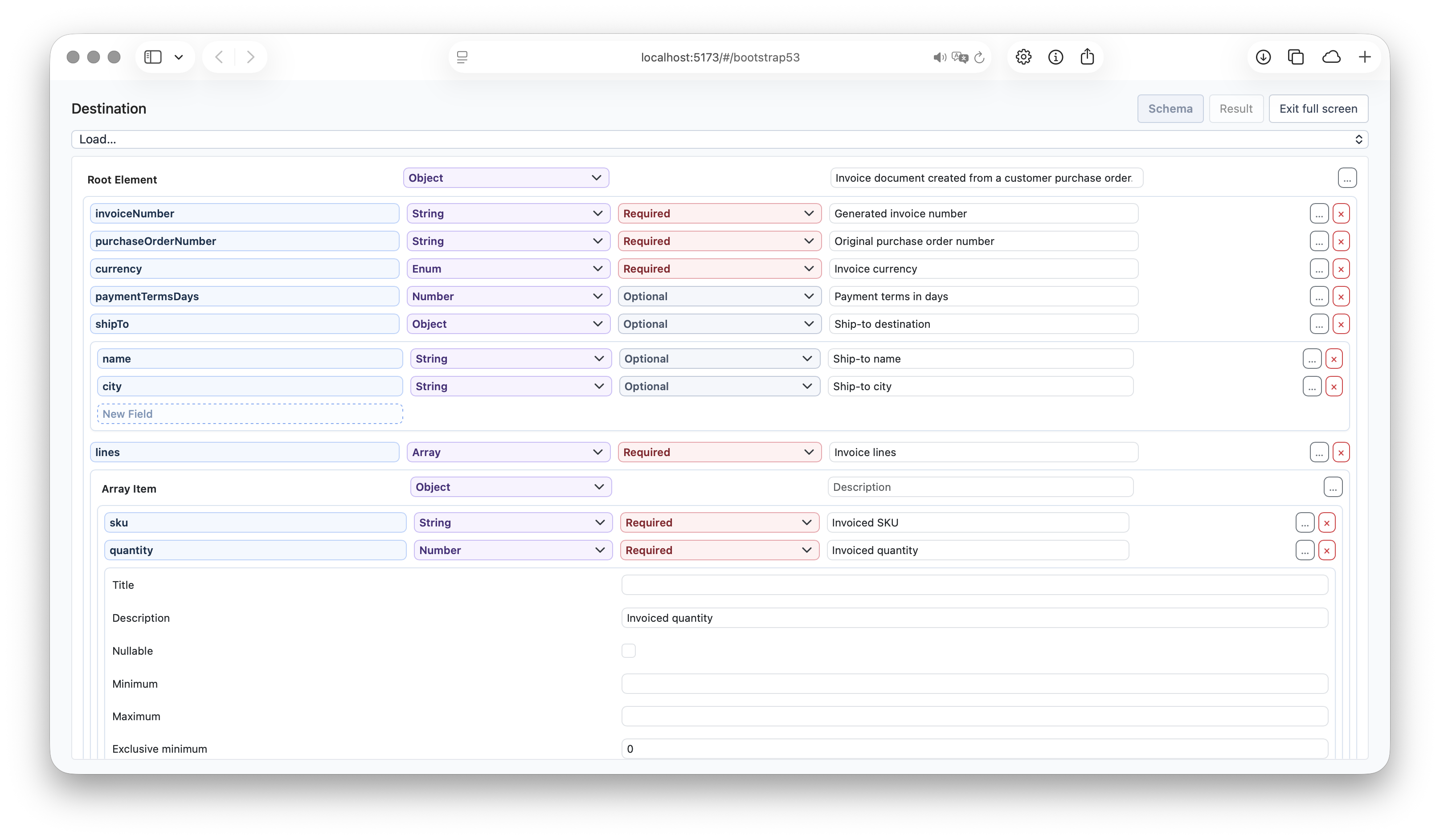
Try the schema editor in the source and destination panels of the interactive playground.
Installation
React is an optional peer dependency of morphos:
npm install morphos react react-dom
Importing morphos/react-schema-editor does not require Bootstrap or another UI framework.
Quick Start
import { useState } from 'react';
import { SchemaEditor, type JsonSchema } from 'morphos/react-schema-editor';

const initialSchema: JsonSchema = {
	type: 'object',
	properties: {
		invoiceNumber: { type: 'string' },
		totalAmount: { type: 'number' },
		billTo: {
			type: 'object',
			properties: {
				name: { type: 'string' }
			}
		}
	},
	required: ['invoiceNumber']
};

function InvoiceSchemaEditor() {
	const [schema, setSchema] = useState<JsonSchema>(initialSchema);

	return <SchemaEditor value={schema} onChange={setSchema} />;
}
onChange receives the complete current schema, so the same state can drive validation, previews, persistence, or a
MappingEditor.
For an uncontrolled editor, pass defaultValue instead. The current value remains available through the editor ref.
Customize the Layout
The editor is intentionally headless at its structural boundaries. It supplies ready-to-render controls and nested content, while your components decide where and how they appear.
For example, replace the default inline nested-properties section with your application’s dialog components:
import type { SectionProps } from 'morphos/react-schema-editor';
import { Dialog, DialogContent, DialogTrigger } from './ui/Dialog';

function NestedPropertiesDialog({ children }: SectionProps) {
	return (
		<Dialog>
			<DialogTrigger>Edit nested properties</DialogTrigger>
			<DialogContent>{children}</DialogContent>
		</Dialog>
	);
}

const components = { Section: NestedPropertiesDialog };

<SchemaEditor
	value={schema}
	onChange={setSchema}
	components={components}
/>
The schema editor still owns property creation, removal, type changes, required flags, and nested state. The injected component only changes presentation. The same pattern works with drawers, popovers, tabs, accordion panels, and your design system’s form controls.
Plain HTML and CSS
Built-in defaults render plain HTML with dm-schema-editor-* class hooks. Style those classes directly or replace only
the slots that need application-specific behavior.
import { SchemaEditor, type TextInputProps } from 'morphos/react-schema-editor';

const TextInput = ({ value, onChange, placeholder, readOnly }: TextInputProps) => (
	<input
		className="app-input"
		value={value}
		onChange={event => onChange(event.target.value)}
		placeholder={placeholder}
		readOnly={readOnly}
	/>
);

const components = { TextInput };

<SchemaEditor components={components} />
Bootstrap Component Sets
Bootstrap integrations only emit classes; the corresponding Bootstrap CSS remains under your application’s control.
import bootstrap34 from 'morphos/react-schema-editor/bootstrap34';
import bootstrap53 from 'morphos/react-schema-editor/bootstrap53';

<SchemaEditor components={bootstrap53} />
Individual themed components are exported when you want to combine a theme with custom slots:
import { Row, TextFieldSetting } from 'morphos/react-schema-editor/bootstrap53';
Supported Schema Editing
The editor supports:
- object properties and required flags;
- strings, numbers, integers, booleans, objects, and arrays;
- nested objects and array item schemas;
- recursive
allOf,anyOf, andoneOfcomposition; - multiple data types declared with a
typearray; - nullable fields, titles, descriptions, formats, enums, and examples;
- numeric, string, array, and object constraints exposed by the selected field type;
- controlled, uncontrolled, read-only, and root-hidden rendering.
String formats and enums appear as recognizable options in the type selector. Enum and example values use one value per line in their default textarea editors.
Composed Schemas
Choose All of, Any of, or One of from a field’s type selector. The field’s current schema becomes the first option, preserving its properties and constraints. Use Add option below the options to add more branches.
Each option uses the same recursive schema editor, so it can contain properties, arrays, settings, and further composition. Types and constraints are defined within the options:
{
	"oneOf": [
		{ "title": "Person", "type": "object", "properties": { "name": { "type": "string" } } },
		{ "title": "Company", "type": "object", "properties": { "registration": { "type": "string" } } }
	]
}
Schemas without an explicit type appear as Unspecified rather than being assigned a type by the editor.
Multiple Types
Choose Multiple types to allow a field to accept more than one JSON data type. The editor stores the selection in
the schema’s type array and exposes the settings applicable to the selected types:
{
	"type": ["string", "number"],
	"minLength": 1,
	"minimum": 0
}
Unlike anyOf and oneOf, all selected types share the same schema. Selecting both object and array therefore
shows both the property editor and the array-item editor. null is available in the type checklist; for a single
non-null type, the existing Nullable setting remains the shorter equivalent.
API
<SchemaEditor
	value={schema}
	onChange={setSchema}
	hideRootElement
	exposeTitle
	exposeDescription
	readOnly
	components={components}
	labels={labels}
/>
| Prop | Type | Description |
|---|---|---|
value |
JsonSchema |
Controlled schema value. |
defaultValue |
JsonSchema |
Uncontrolled initial value, used once on mount. |
onChange |
(next: JsonSchema) => void |
Receives the complete schema after each edit. |
hideRootElement |
boolean |
Renders only the root object’s properties or root array’s item editor. |
exposeTitle |
boolean |
Shows each field’s title in its main row. |
exposeDescription |
boolean |
Shows each field’s description in its main row. |
readOnly |
boolean |
Disables editing and suppresses onChange. |
components |
Partial<SchemaEditorComponents> |
Replaces any built-in UI slot. |
labels |
Partial<SchemaEditorLabels> |
Replaces any user-visible label. |
Use hideRootElement when the surrounding page already represents the root context. The root schema still comes from
value or defaultValue, including its type, properties, array items, and composition branches.
The component exposes this ref handle:
interface SchemaEditorHandle {
	readonly value: JsonSchema;
}
Component Slots
| Component | Purpose |
|---|---|
Container |
Wraps all rows at the current schema level. |
Row |
Places the field name, metadata, type, requirement, actions, and nested section. |
Section |
Places nested object properties or an array item editor. |
TextInput |
Edits property names and exposed text values. |
FieldLabel |
Renders read-only labels such as the root or array item name. |
TypeSelector |
Selects the schema type, format, enum presentation, or composition mode. |
MultipleTypeSelector |
Edits the type checklist shown first in expanded field settings. |
RequirementControl |
Changes whether an object property is required. |
SettingsButton |
Opens or closes field settings. |
SettingsGroup |
Places the expanded settings area. |
TextFieldSetting |
Edits text and numeric constraints. |
CheckboxFieldSetting |
Edits boolean settings such as nullable. |
TextareaFieldSetting |
Edits multi-line enum and example values. |
RemoveButton |
Removes a property or composition branch. |
AddPropertyInput |
Creates a property at the current object level. |
AddOptionButton |
Adds another branch to an allOf, anyOf, or oneOf schema. |
Override SettingsGroup to move field settings into a custom panel or popover. Override Section to change how nested
schemas are navigated. Override Row when the complete field layout belongs to your design system.
Localization
Every visible string comes from SchemaEditorLabels. Override only the labels needed by the application:
const labels = {
	addProperty: 'Add field',
	propertyName: 'Field name',
	removeProperty: 'Remove field'
};

<SchemaEditor labels={labels} />
Related
- Use
morphos/reactto visually build JSON-to-JSON mapping specifications from schemas. - Use the main
morphospackage to validate, store, and execute the resulting mappings.